Manchester City shirt | Sky blue "Citizens"
The new Manchester City shirt has landed and we are gonna take it to the test as always! The reigning champions of England, Manchester City, are a part of a deadly race to win the Premier League title. Guardiola's guys show no signs of mercy as they continue to tear up the Premier League but not as convincing as last year. This year, Liverpool is right up there in the title race with only a few points seperating them at the moment. A very exciting race! Meanwhile, Manchester City seem to have pushed through the problems they have had in recent years in European club football. They are into the quarterfinals of this years Champions League and is by many considered one of the favourites to go all the way. A tough draw see them take on the Spurs from Tottenham. Will it be this year that Manchester City go all the way in the biggest tournament in club football?

The new Manchester City shirt: Sky blue as always
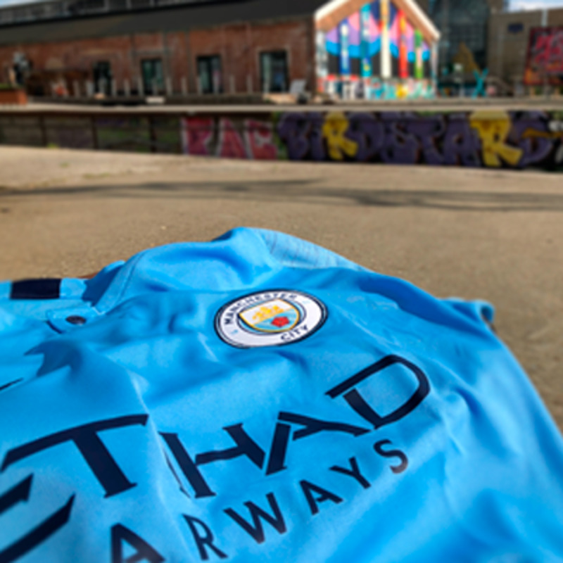
The Citizens have managed to win the Premier League three times since they were bought by richmen from Abu Dhabi in 2008 - and this year, they are fighting for it aswell. When reviewing shirts from the top European clubs, Manchester City is inevitabely going to be among them. The new Manchester City shirt is manufactured by Nike, their shirt provider since 2013. The sky blue colour is almost iconic. The colour is associated with Manchester City by most people interrested in football.

The new City shirt is produced in 100% polyester og equipped with Nike's own DriFIT-technology. This makes the shirt breathable and ventilating, which makes sure you will be dry and comfortable due to the sweat wicking ability in the shirt. Your shirt will not be clinging to your body when the sweat pours in the heat of the game. Do you know how the sweat wicking works? We'll tell you! The fabric is constructed to move the moisture from the inside of the shirt to the outside and spread it to a bigger area. This makes the sweat evaporate faster and that is fantastic when working out in a Manchester City shirt.
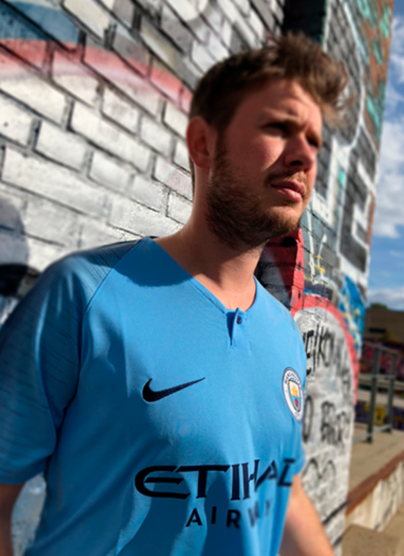
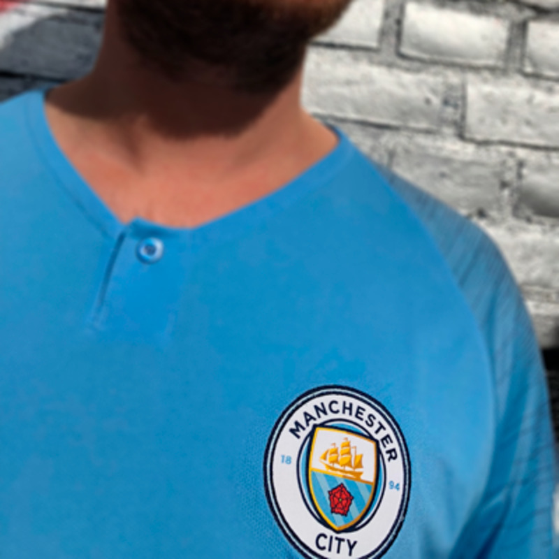
The design of the shirt this year is not much different to the shirt from last year - but Nike actually managed to pull of a few nice details. The new Manchester City shirt has the same charactaristic sky blue colour as always but a new touch found a way to the collar of the shirt. Nike added a button to give it a different look. The sleeves of the shirt also received a little tweek which gives a brilliant contrast to the sky blue. The sleeves has a dark blue pattern which works it's way towards the collar and over the back of the shirt - a brilliant touch! Really gives the shirt an edge and a nice alternative to last year's shirt. The neck-area has "City" written on the outside. "The Citizens" take pride in being the city's team despite having quite a competitor at the other end of the town. Inside the shirt, also in the neck-area, the club's official hashtag "#MANCITY" is printed. Nike tried to bring in some new additions to this year's Manchester City shirt but it's not a revolution. Nike kept the sky blue colour that everybody expects of Manchester City.


The "new" Manchester City logo
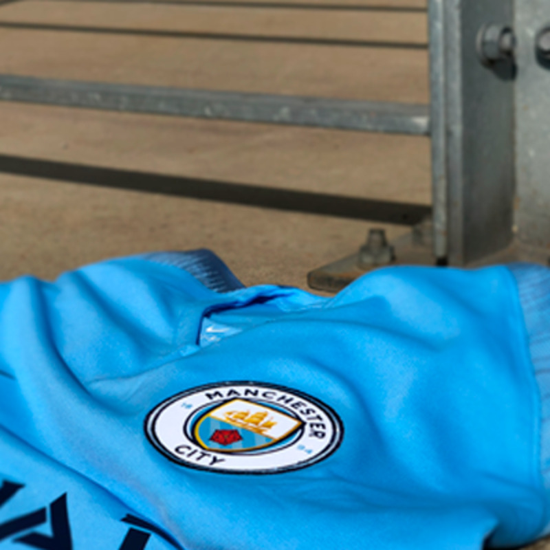
A couple of seasons back - in 2016 - the old Manchester City logo was replaces. The well known Manchester City logo, originally from 1997, with the eagle and the three stars behind the ship on the coat of arms. The eagle and and stars had no connection to Manchester City as a club or the year the club was founded. For that reason, Manchester City decided to go back to a logo looking very similar to the logo before 1997. A circle with the text Manchester City and the year of the club's founding. Inside the circle is a coat of arms with the ship and a red rose. The new logo was received with great enthusiasm by the fans. Manchester City invited fans to share their opinion regarding the new logo - and with great success. But where does the ship come from? Have you ever noticed that the ship is also in Manchester United's logo? The observant reader might quickly recognise the correlation. The ship is a part of the city of Manchester's coat of arms due to the Manchester Ship Canal, which helped the city's trading. A last thing worth mentioning is the text. The club decided to strike the text "F.C.", which always has been a part of the shirt.
The review: What we think of this season's shirt
- There's no doubt about the shirt's quality! It's nice and airy. Even when you use it on a on a hot summer day, the fabric's ability to breathe is absolutely top quality. The extra ventilation in the neck-area also works very well on a hot summer day.
- When it comes to the design of the shirt, it's hard to come to a final conclusion - as mentioned earlier: is the sky blue colour not what everybody associates with a Manchester City shirt? Not much of the design has been changed. A little button and som dark blue pattern on the sleeves and shoulders is the head line changes. The shirt looks like the classic City look.
- Huge credit to Manchester City for involving the fans in the new logo. They obviously didn't change the logo this year, but it's still an honorable mention! Huge plus for the shirt.