Liverpool shirt | SportMember reviews
What a season Liverpool FC is having so far! Jürgen Klopp's boys are swinging this season, playing entertaining football and among the biggest favourites for the 2 big titles. Top of the table in the Premier League with only 7 games to play. In to the quarterfinals in the Champions League after beating the mighty Bayern Munich. You can't avoid to mention Liverpool when you talk about the biggest clubs in Europe, and this season, they are really living up to that. Will Liverpool finally get the Premier League title they have been missing for so many years now? Maybe even add Champions League title number 6 to the trophy cabinet? This season might be seminal for Liverpool FC and we took the legendary red shirt for a review.


Liverpool shirt: The Retro-look is back
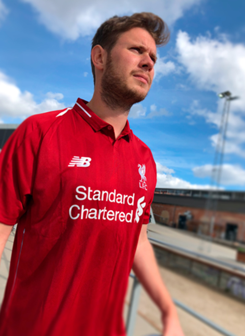
Finally! The Liverpool shirt has landed at SportMember and we are so excited. This season's Liverpool shirt is manufactured by New Balance, a first time in our shirt review series! The fabric is 100% polyester and produced with New Balance's own 'NB DRY' technology. 'NB DRY' wicks the sweat away and keeps you dry and fresh during your match or practice.

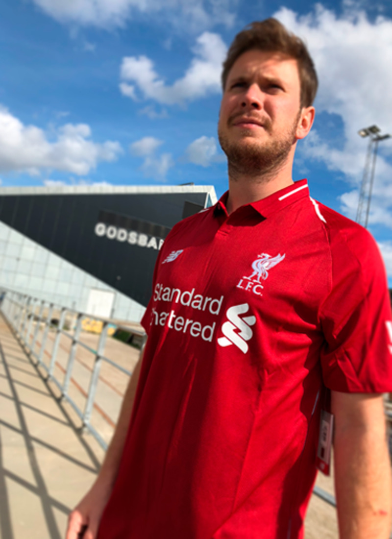
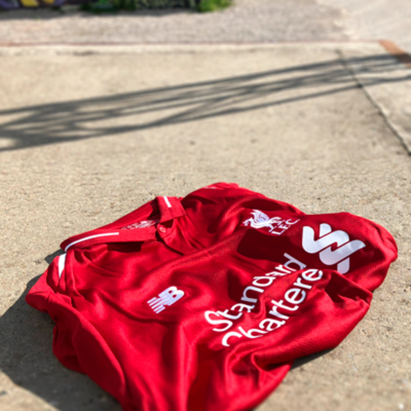
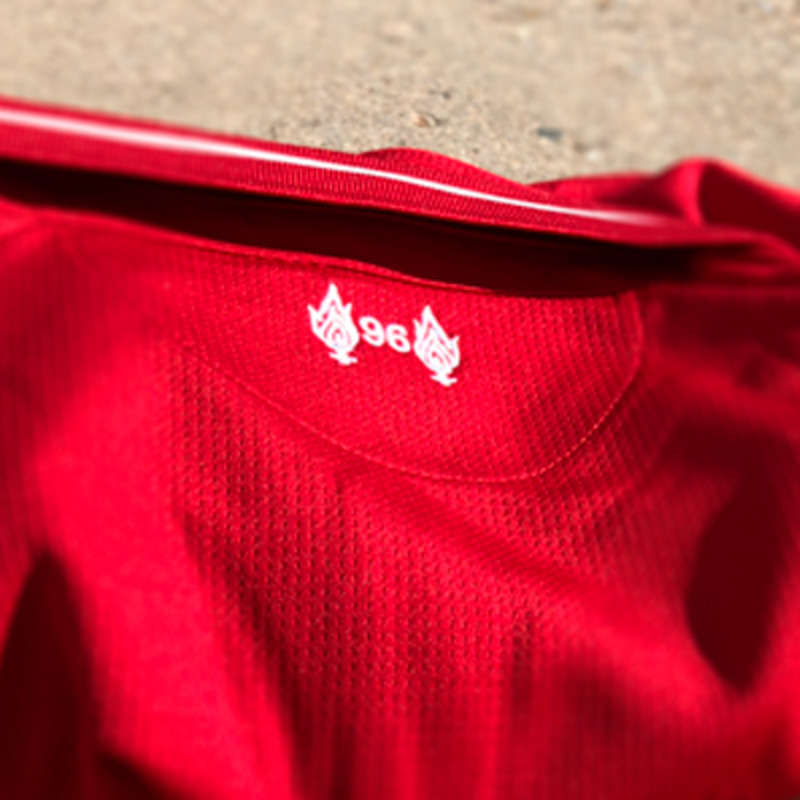
At first glance, the new Liverpool shirt has a very classic design where New Balance threw in some nifty details. As a Liverpool player, you are wearing the same deep red colour as always. New Balance calls the colour "Red Pepper". The front of the shirts is marred by a "jaquard'-pattern. Down the sides of the shirt are 2 white stripes. It's hidden away untill you start moving. A small detail which might seem a bit unimportant, but it really adds a layer to the shirt in game situations. The biggest thing we notice is the collar. The white stripe and a button gives the shirt a real retro-look. A last detail on the shirt is at the neck. A tribute to the victims of the Hillsborough-tragedy in 1989. Symbolized with 2 torches and the number '96', the amount of victims that passed away.

Liverpool logo: 'The Liver Bird'
The Liverpool logo has experienced quite a few visual changes since the club was founded in 1892. The logo had a traditional coat of arms - just like most of the other clubs in the Premier League - through a long period. The only thing surviving from the original logo is "The Liver Bird", the only thing to be in the logo since the original edition of the Liverpool logo. The current logo is a very minimalistic versionm with only "The Liver Bird" and the letters "L.F.C". The minimalistic logo really works well with the retro look of the shirt.
Liverpool club-captain Jordan Henderson loves the shirt:
Our kit isn’t just something we wear to play – it is part of who we are as a team. We feel immensely proud when pulling on the LFC home shirt, it means more to us than you could even imagine; after all, Liverpool Football Club is like no other. I have no doubt that our fans will love the new kit and will wear it with pride when supporting us this coming season.
The Review: 2018/19 Liverpool shirt
- This season's Liverpool shirt is beautiful. Classic, retro look. Different than many other shirts out there, and it really pays off.
- Liverpool took a chance on New Balance and it really payed off. New Balance has really done a good job of creating a different, yet classic shirt for a club that really deserves it.
- The logo fits and the shirt are a match made in heaven. The simplicity and style is overwhelming.